Suzuki Institute
International Music School, Hong Kong (2019)
HKSMI is a family-centric music school based in Hong Kong, teaching violin and cello through the renowned Shinichi Suzuki method.
Our brief: to create a brand that reflects musical rigour and emotional connection — for children, parents and teachers alike.
The rebrand reinterpreted the values of the Suzuki philosophy — discipline, empathy, and beauty in repetition — into a modern, human-centered identity that feels both structured and poetic.


Logo Concept
The logo’s flowing geometry evokes rhythm and precision — a modern counterpoint to the tradition of classical training. It captures the continuity of learning and the dialogue between teacher and student. The color palette takes inspiration from natural instrument tones: soft whites, warm woods, and graphite greys, expressing calm focus and refinement.
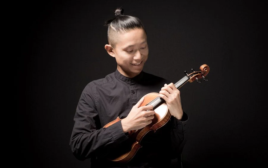
Photography & Art Direction
Photography was central to conveying the brand’s human warmth and institutional sophistication. The visuals were edited in a coherent style: muted colours, consistent exposure, selective depth of field — creating an atmosphere of focus, warmth and accessibility.
Kids & Students: we captured children in the moment of learning — concentrating on bowing, looking to the teacher, playing in small groups. These candid frames emphasise growth and focus rather than performance-posing.
Teachers: portraits of instructors were shot in situ, in the studios, interacting with students and parents. The aim was to show authority without distance — mentors guiding rather than dictating.
Parents & Family Involvement: one of the Suzuki method’s key pillars is parental participation — so we included imagery of parents observing, playing alongside children, joining group-classes. This reinforces the idea of the music-learning village.
Interiors: the physical spaces were shot to emphasise light, texture and the calm energy of the school environment. Minimal distractions, wooden floors, soft natural light, open group-class room and studios.
Website & Digital Experience
The site was structured like a musical score: clear hierarchy, generous whitespace, rhythmic pacing. Navigation is simple: programs → lessons → teachers → enroll. The design uses modern typography and consistent iconography referencing musical forms. Through photography and layout, we ensured that the digital experience feels as inviting as the physical studio. Text highlights HKSMI’s values: every child can learn, parents are integral, community matters.