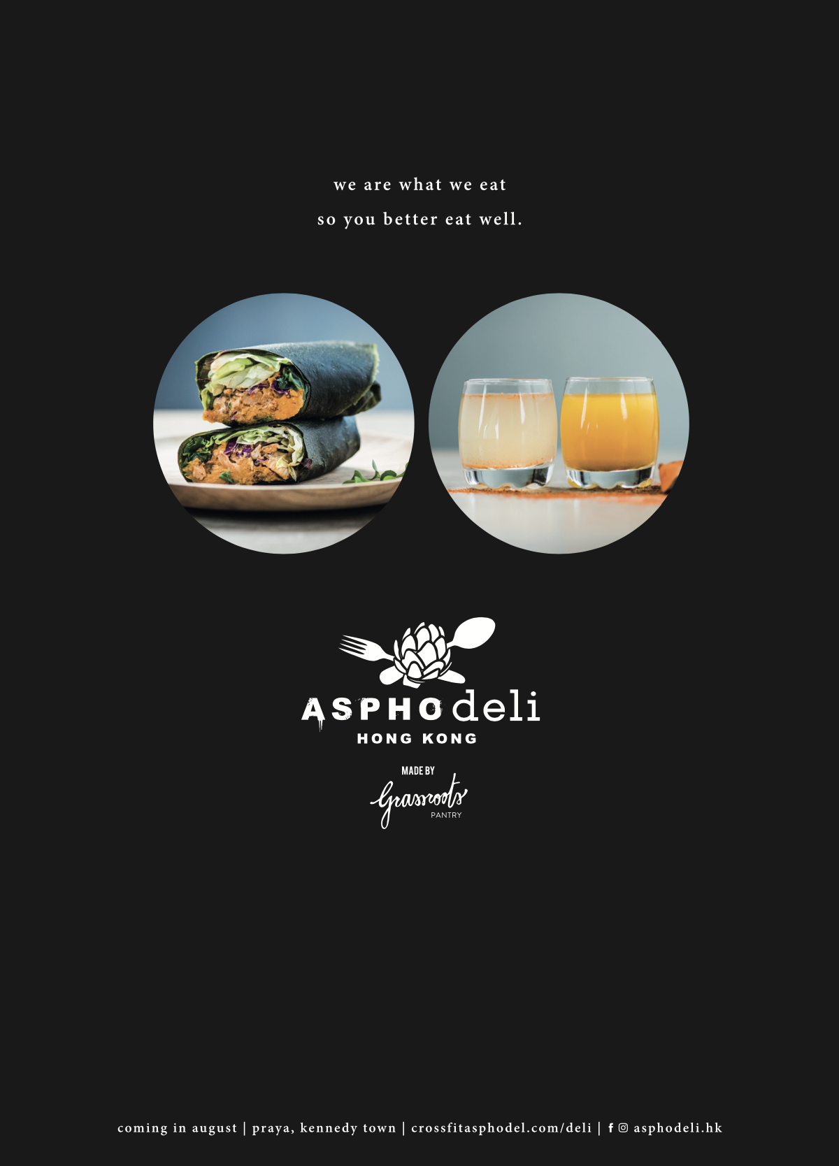
AsphoDeli
Healthy Food, Hong Kong (2018-2021)
Created for Asphodel Fitness Hong Kong in collaboration with Chef Peggy Chan of Grassroots Pantry, AsphoDeli was conceived as a fresh, modern food brand rooted in wellness, performance and everyday ease. Positioned beside the gym in Kennedy Town, the concept brought together plant-based nutrition and a more elevated retail experience, designed to appeal not only to fitness clients but also to a broader urban audience looking for healthy food presented with more style, clarity and intention.
We developed the brand from the ground up, creating a complete identity and communication system across strategy, naming expression, logo design, tagline, visual language, brand artworks, marketing materials, website design, in-store collateral and bilingual assets in English and Cantonese.
Structure, Logo & Tagline / Narrative
The creative challenge was to avoid the usual visual clichés of the healthy food category. Rather than leaning into something overly earthy, preachy or medicinal, the brand was designed to feel clean, contemporary and quietly premium.
The identity balanced freshness with discipline, combining a refined editorial sensibility with a more approachable retail energy. It needed to feel credible in a fitness environment, desirable as a lifestyle brand, and clear enough to work effortlessly across menus, packaging, signage and digital touch points.
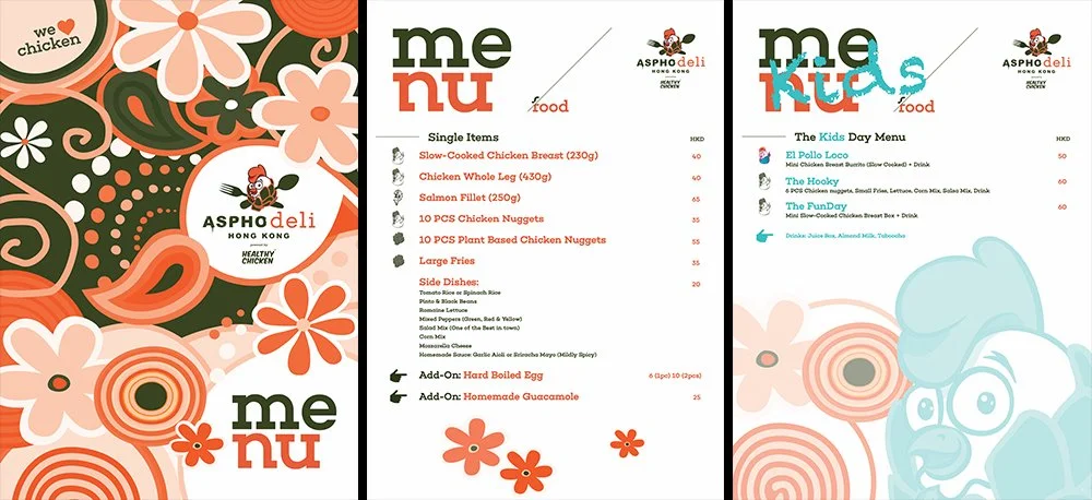
The logo system was developed to be simple, distinctive and highly adaptable, able to sit comfortably across everything from storefront applications and takeaway packaging to campaign graphics and social content.
Supporting brand elements introduced structure and rhythm, helping the identity feel cohesive across formats while giving the brand enough personality to stand apart in a crowded wellness market.
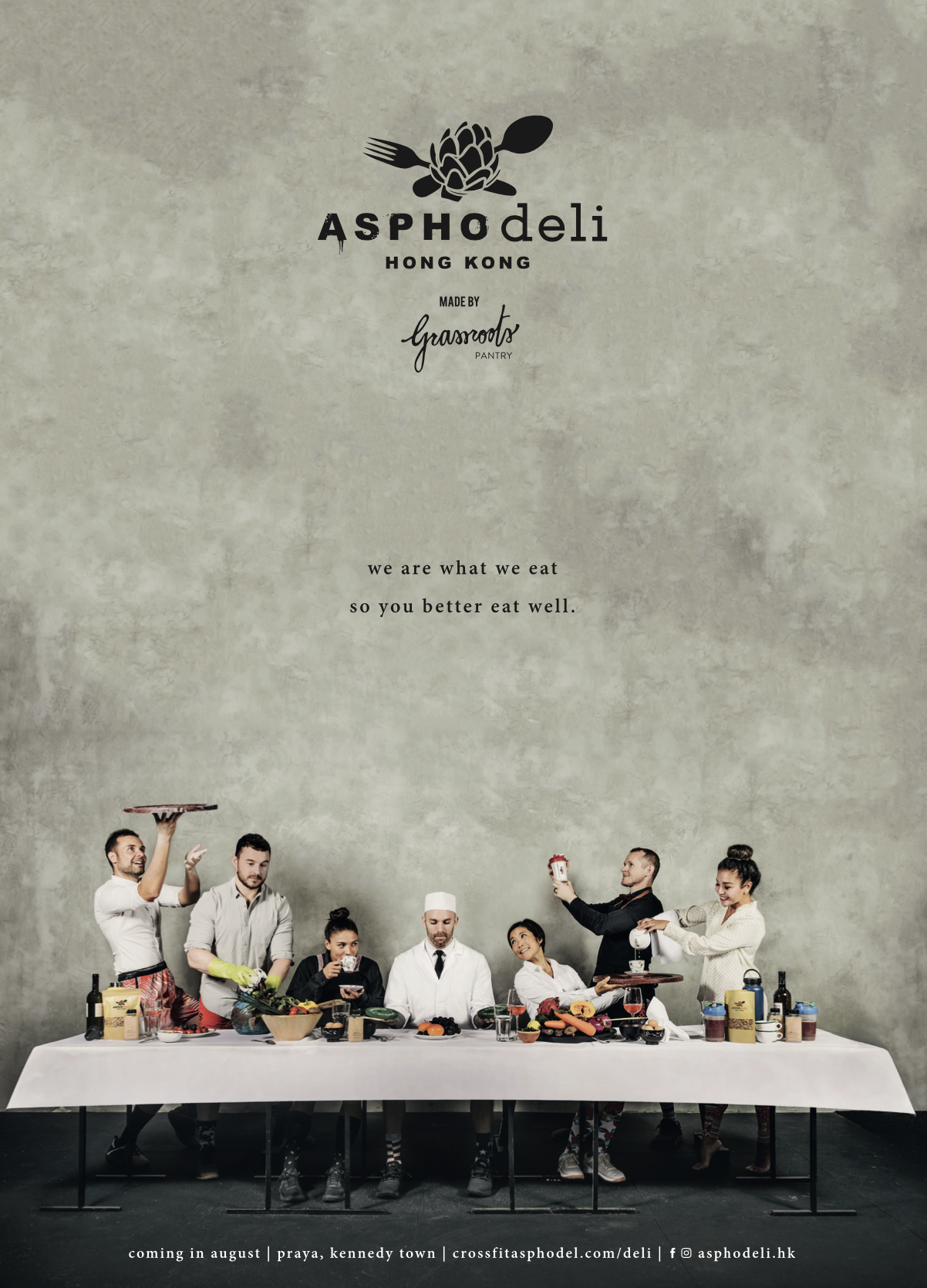
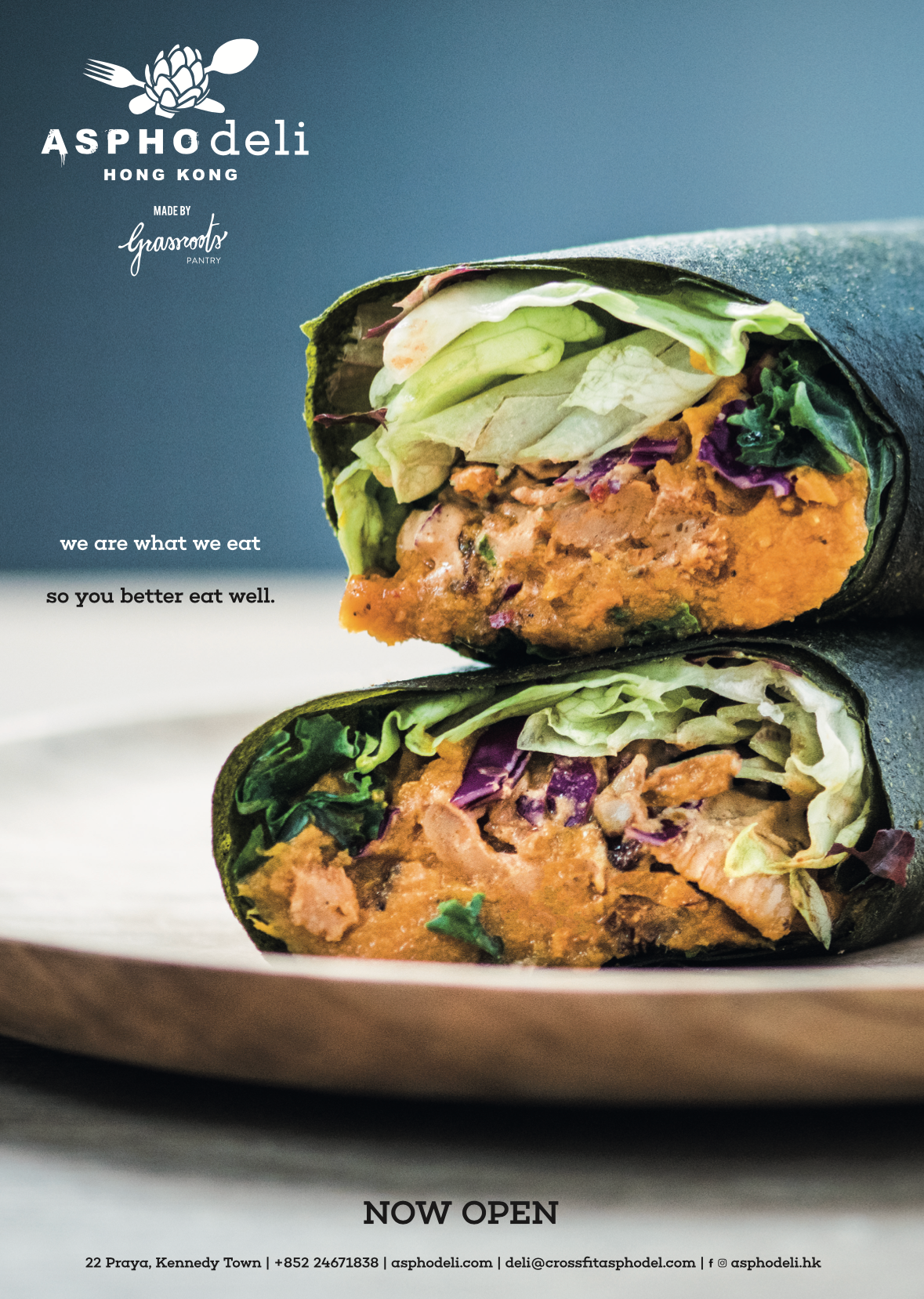
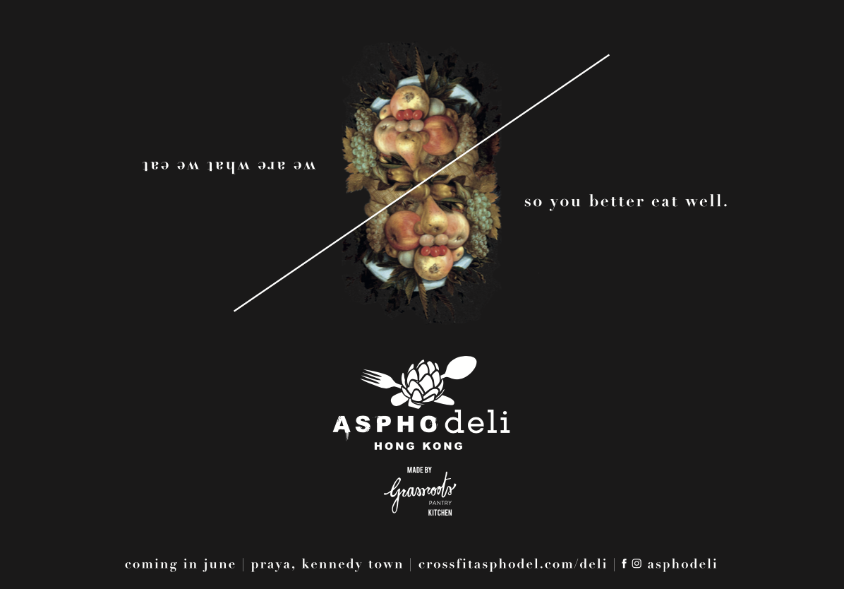
The tagline: “we are what we eat, so you better eat well” and the overall messaging framework were crafted to reinforce the idea of the daily necessity of a balanced diet with food both nourishing and healthy, regardless of cooking abilities and time - or lack thereof - allocated to cook.
Visual Style & Aesthetic
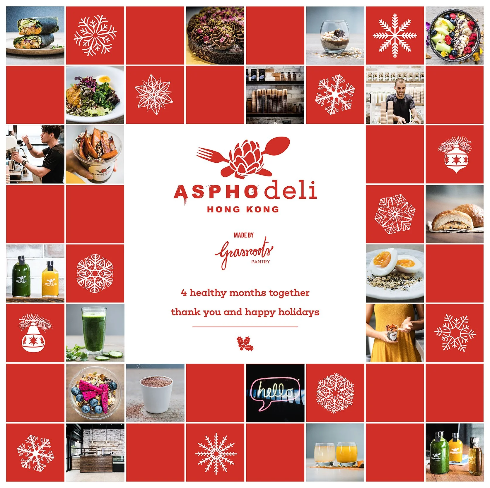
Alongside the identity, we created a suite of custom artworks and branded graphic assets to give the project a more recognizable visual world: these helped move the brand beyond a purely functional deli aesthetic and into something approachable and expressive, while still keeping the overall system clean and controlled.
This visual language was then extended across menus, promotional material, packaging, printed matter, in-store communications and launch assets, ensuring consistency from first impression to daily use.
Multilingualism
A key part of the project was its bilingual implementation. Assets were designed to work seamlessly in both English and Cantonese, with the typography, layout logic and hierarchy carefully considered so the brand would feel native to Hong Kong rather than simply translated into it.
This allowed the identity to remain elegant and coherent across different formats while speaking to the city’s real cultural and commercial context.
Photography
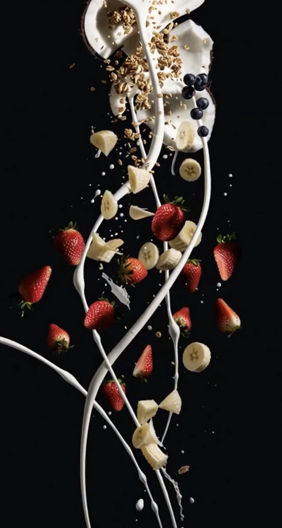
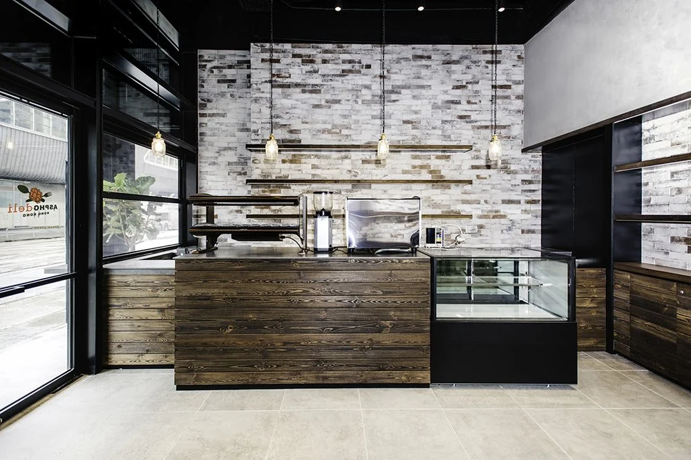
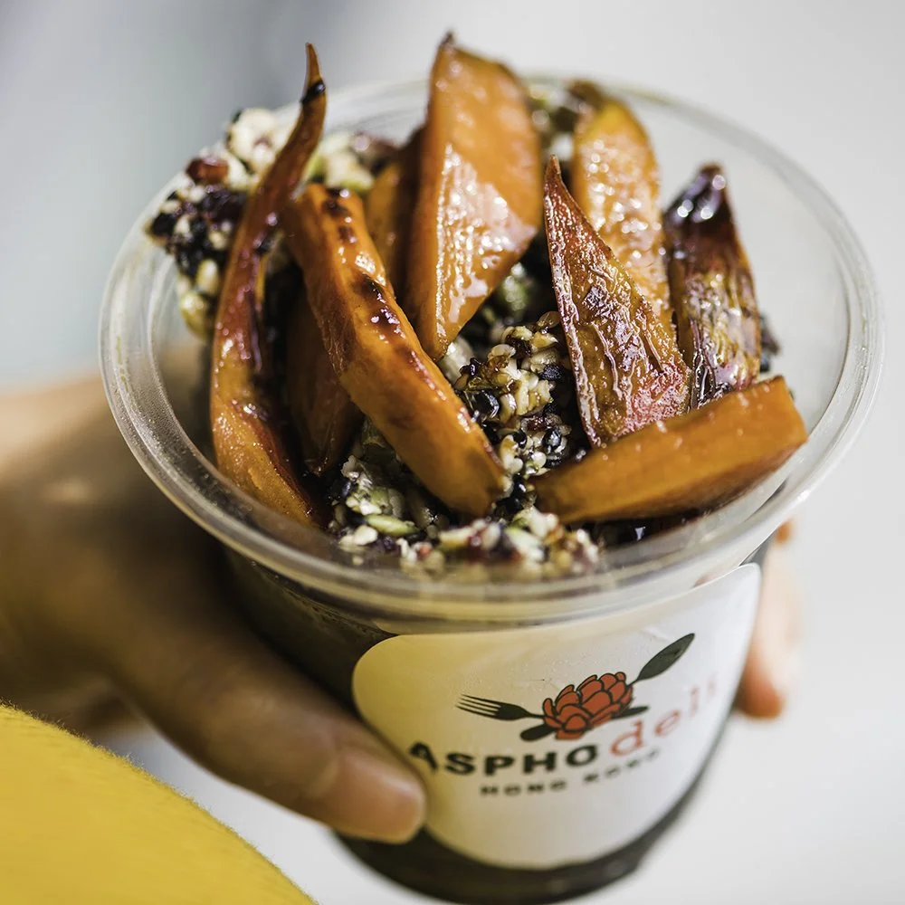
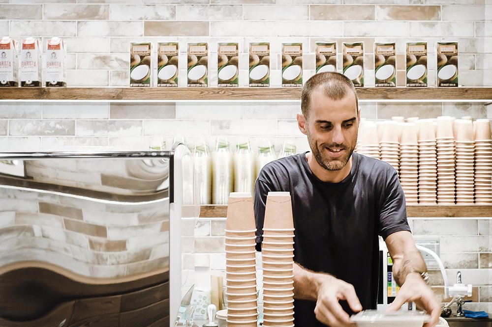
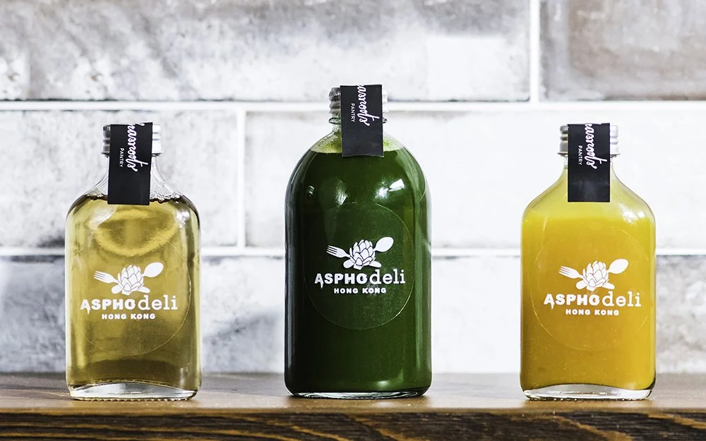
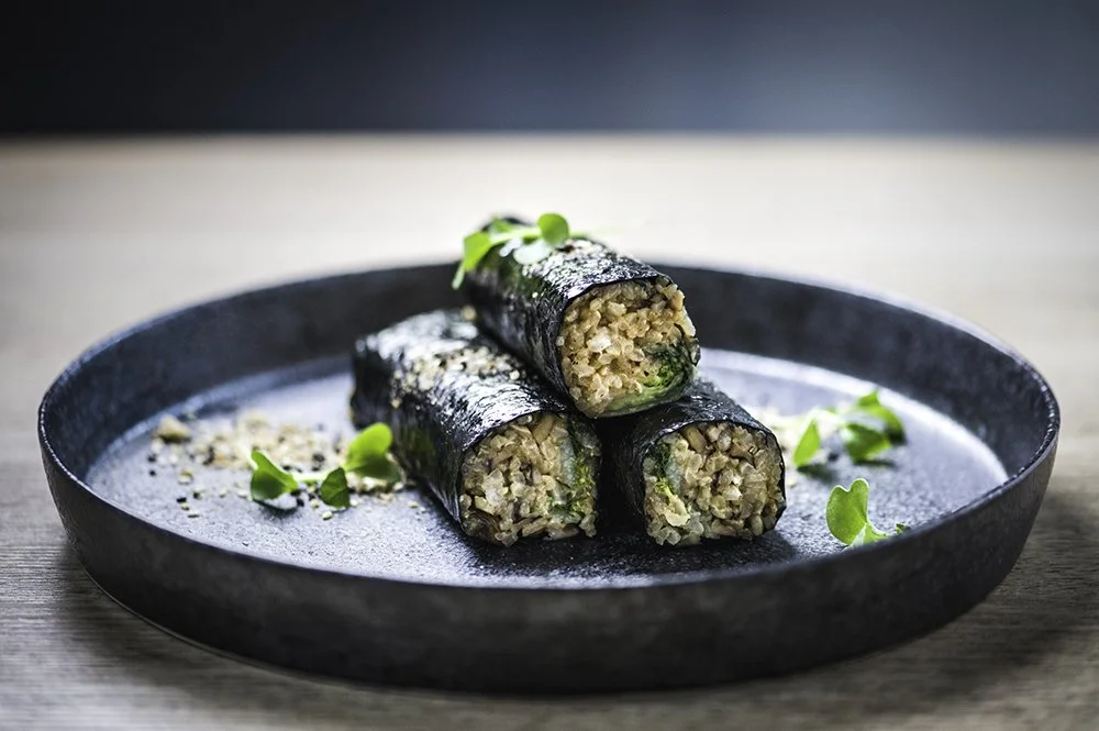
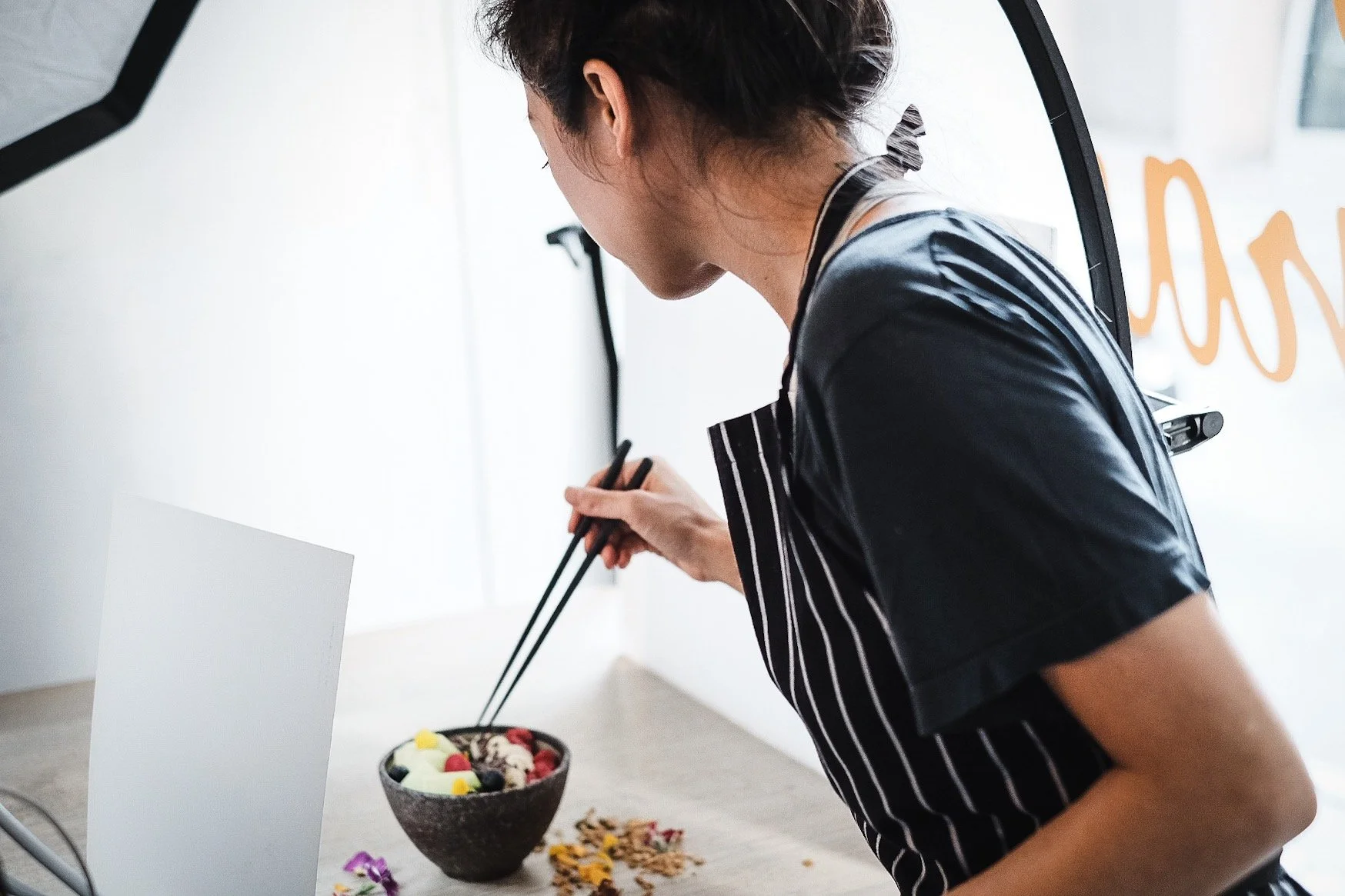
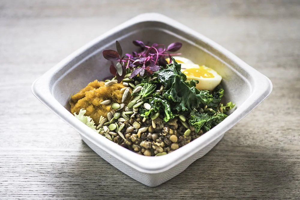
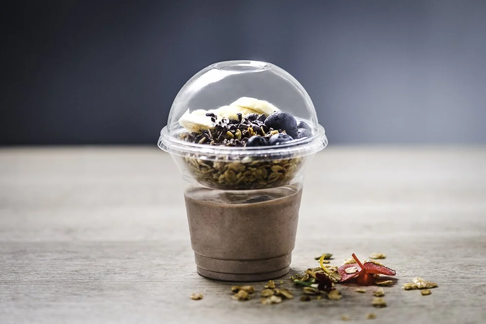
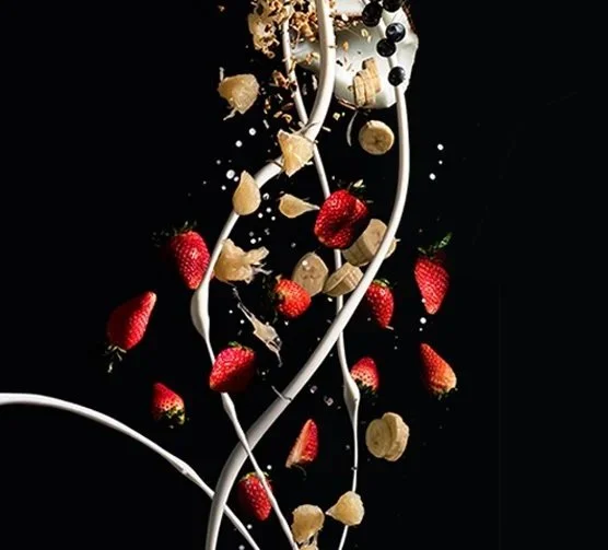
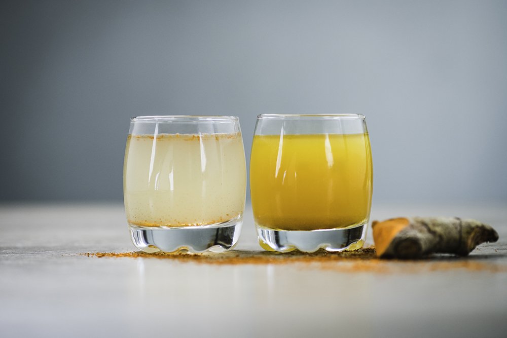
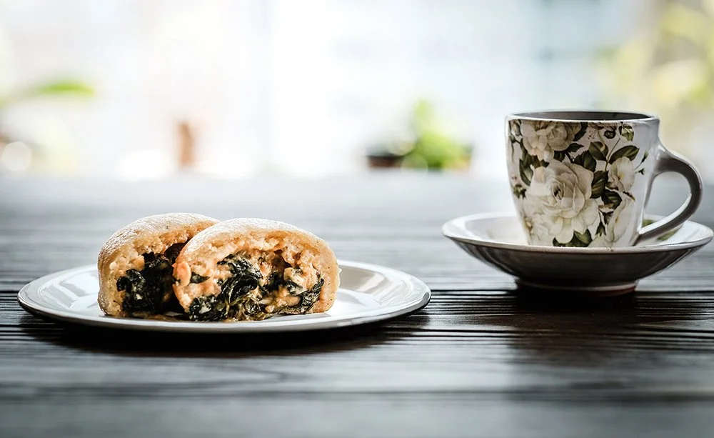
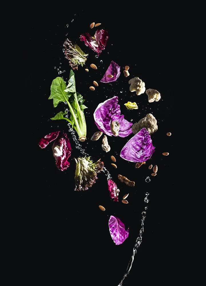
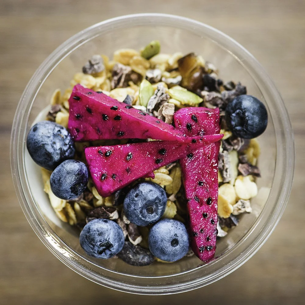
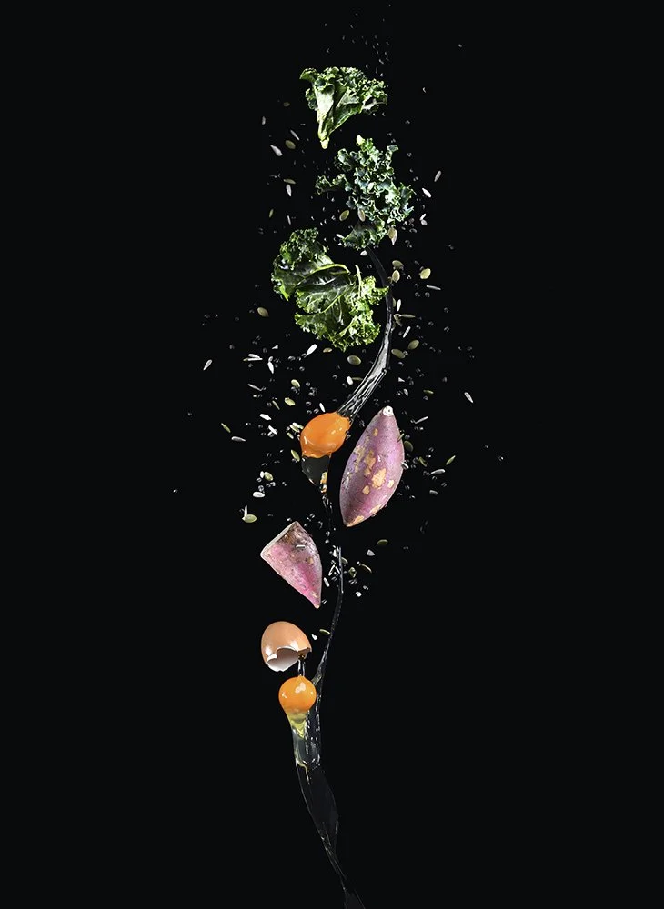
The visual direction extended into a carefully considered photoshoot for both the food and the interiors, designed to translate the brand’s tone into imagery. In collaboration with Chef Peggy Chan, the food photography was art directed to celebrate freshness, colour and balance, presenting each dish in a way that felt clean, contemporary and appetising without becoming overly staged.
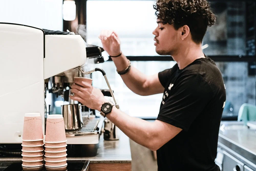
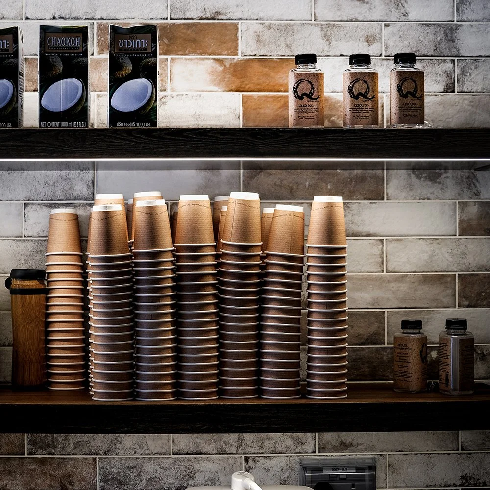
The interior imagery was approached with the same sensibility, capturing the space as bright, minimal and welcoming, while reinforcing the overall identity of the brand. Together, the shoot created a visual bridge between product, environment and communication, helping Asphodeli feel cohesive across every touchpoint.
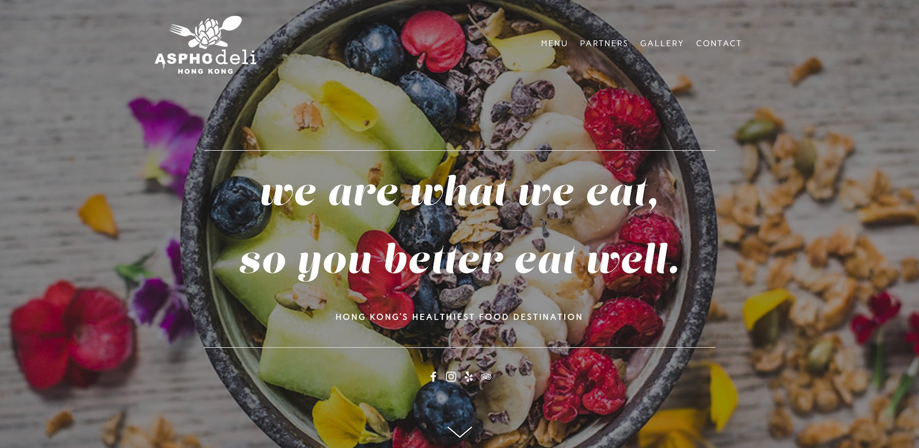
Web
The website carried the same principles into digital: minimal, polished and easy to navigate, with an emphasis on clarity, brand atmosphere and visual consistency.
Rather than overloading the experience, our design choices supported the concept with a crisp and contemporary interface aligned with the physical environment and the broader identity system.
The result was a complete brand world for a healthy food concept that felt more design conscious, modern and culturally appropriate than the category norm: a project that connected fitness, hospitality and lifestyle through a cohesive bilingual brand experience.
Campaigns & Print Ads
The project included the launch campaign together with a series of monthly visual advertisements for Hong Kong’s wellness LIV Magazine, created over an extended period to give the brand visibility and continuity beyond the initial opening.
Designed with the same editorial clarity as the wider identity, the ads helped position Asphodeli as a polished, lifestyle-driven wellness concept rather than just another healthy food outlet.
Across multiple consecutive issues, the campaign established a consistent visual presence through strong imagery, clear messaging and a cohesive art direction aligned with the brand’s overall world.