Lövstjärnan Fabriks
Military & Defense Equipment, Sweden/Canada (2024)

The brief for Lövstjärnan Fabriks AB was precise: the name itself is the identity.
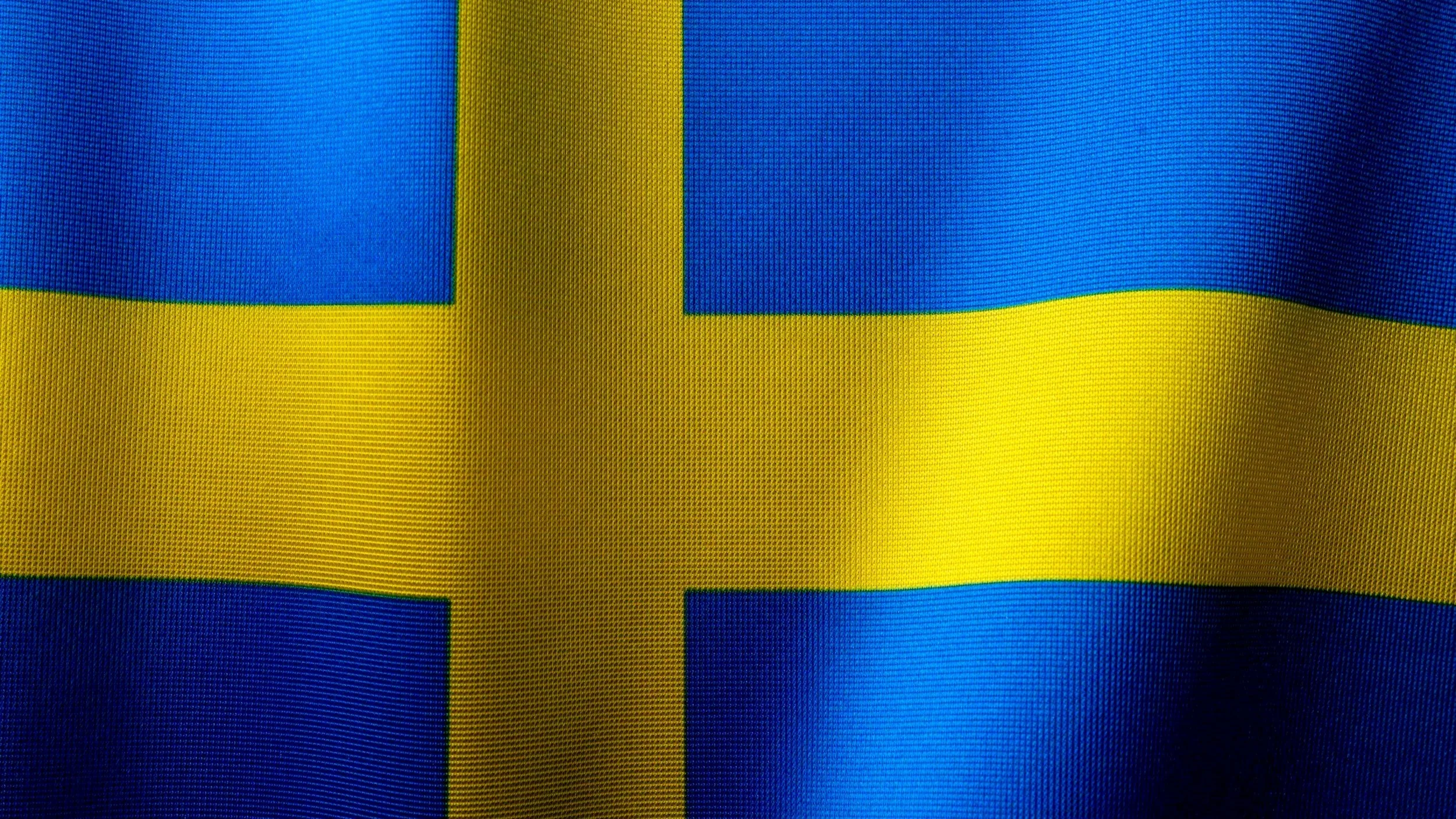
In Swedish, lövstjärnan means "leaf star" - a compound image already encoded with dual heritage, pointing simultaneously toward Scandinavian roots and Canadian operational chapter.
The design challenge was to give that duality a mark that felt timeless, earned, and not assembled.
Working within a heraldic framework, we developed four distinct emblem directions, each anchored by a shield silhouette, a Nordic cross in signature gold, a Canadian maple leaf, and a six-pointed star, all drawn from the brand name itself, and each expressing a different posture of the same story.
The Offset Emblem
The Offset Emblem explores asymmetric tension within the shield, presenting the cross slightly displaced from centre to create visual momentum.
it was developed across three rendering modes: solid block, linear, and linear negative, to test its versatility across surfaces and scales.
The Full Emblem
The chosen mark, the Full Emblem, earned its place by committing fully to what the brand actually is.
The Nordic cross in signature gold divides the shield into four distinct, fully resolved quadrants: maple leaf, star, solid field, and horizontal stripes, giving the identity the institutional authority of something that has existed for decades, even as it launches.
Two shield registers, pointed and rounded, were developed to give the mark range across formal and contemporary applications.
The result is a crest that carries weight without heaviness: heraldic in structure, precise in execution, and fluent in both the Scandinavian and Canadian visual languages it was always meant to speak.
The Nordic Cross
The Nordic Cross strips the concept back to its most elemental form, pure colour fields, no stripes, maximum graphic confidence, a direction suited to large format applications and a younger, more modern brand expression.
Throughout each direction, both a pointed and a rounded shield register were explored, allowing the client to calibrate the final mark along a spectrum from the institutional to the contemporary.
The consistent palette with a deep navy, golden yellow, and white, ties the family together while ensuring each option reads cleanly in single colour and reversed applications.